My (Brand) Personality
Type: Branding, Brand Identity, Logo Design, Visual Identity System • Tools: Adobe Illustrator
A new look for my design persona inspired by a college's brand identity that encompasses a combination of visual and type elements.
I am a college athletics enthusiast particularly football. I wanted my latest brand identity to reflect my love for college and branding. After looking through a number of colleges' brand identities, these two colleges stood out the most: University of Oregon and Darmouth College. Just like a college's visual identity is broad: logos, marks, and wordmarks. I thought why not have my brand be as expansive and dynamic. My work is not define by a single project or style, but a designer and illustrator who will shape a project based on its message and targeted audience.
The primary logo in which is promptly displayed in the left-hand corner of this website was directly inspired by Darmouth' Pine (or D-Pine). Instead, I swapped the pine for a pen. My most used tool as an illustrator who is obsessed with vector art and its boundless canvas. A logo that connects my creative nuance to potential clients and other like-minded individuals. One logo was not enough. The D (or D-Pen) can stand alone yet also pair well with the wordmark (dongardn), which reflects my web identity. Yes, it is just a combination of my first and last names. However, my favorite logo might just be The Pen alone. The collage-like structure and a color palette of greens and orange creates a visually stunning logo. The Pen will fit nicely on a hat or t-shirt. Swag!
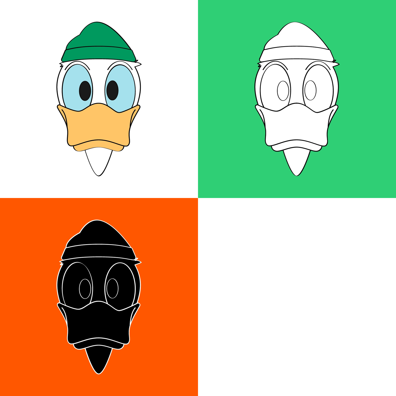
The rest of brand identity is very much inspired by the Oregon Ducks. I decided to lean into my first name, Donald, and include a cartoon Duck. I knew this vast identity system needed to include my greatest creative strength, illustration. Does this duck look familiar to Donald Duck? Yes. If Oregon can legally use it, why not me too 😂. My duck is a little more chill and hip because of the beanie: very much my personality and my winter style. Yet what makes this brand identity collegiate, of course the marks! The interlocking DG is so college and iconic that it drips of what I wanted from this project: a brand identity that is vast, unique, and so me!
